
💡 Notice: The project 'Vitabase' mentioned in this post has undergone a complete rebranding due to a domain dispute. It is now operating under the new name 'Elenixia'.
👉 Read the story behind finding our 0-SERP legendary domain →People don’t buy features, they buy a feeling. I learned that the hard way.
From ‘Loading…’ to a VIP Mind Game
Look, our old editor was functional. User submits a form, they get a plain text screen. It worked. But it felt cheap. It felt weak. So we tore it down. Now, the moment you submit, you’re not just waiting. You are forcibly redirected to the ‘VIP Waiting Room.’ It’s an engineered psychological chamber.
![[Vitabase #10] The Psychological Trap: Luxury UI as a Weapon for Visual Hypnosis](https://kevinsarchive.com/wp-content/uploads/2026/07/photo_20260721_103328.jpg)
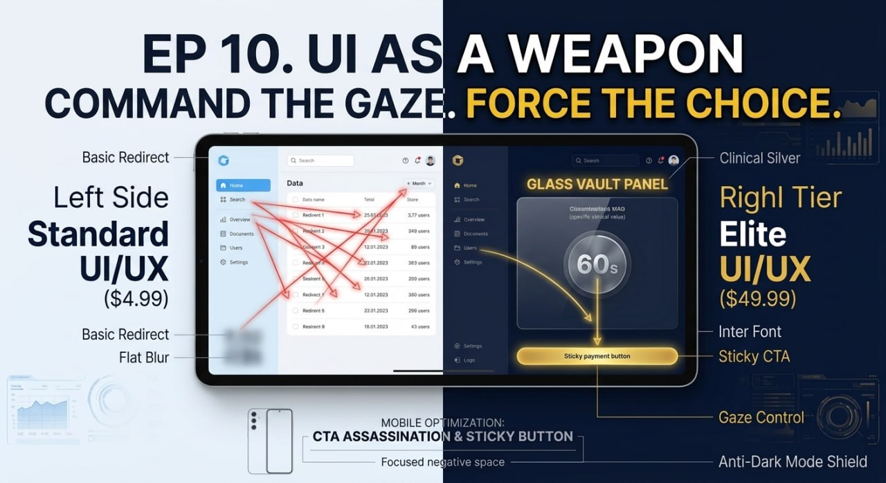
There’s no boring loading spinner. Instead, a ‘Clinical Silver’ metallic gradient pulses softly. A glassmorphism timer counts down 60 seconds. It’s translucent, elegant. That 60-second processing time used to be a liability, a point of friction. Now? It’s a moment of intense focus. Of tension. We turned waiting into a premium experience. We made them *feel* the importance of what was happening behind the scenes. It’s pure frontend hypnosis.
Weaponizing Curiosity
Next, we went on a rampage. I torched every last tacky emoji on the platform. Gone. Replaced with minimalist SVG line icons. We injected the ‘Inter’ font—the same one used by every major Silicon Valley SaaS player—into the global CSS. Instantly, the entire skeleton of the brand felt more expensive, more authoritative.
![[Vitabase #10] The Psychological Trap: Luxury UI as a Weapon for Visual Hypnosis](https://kevinsarchive.com/wp-content/uploads/2026/07/photo_20260721_103331.jpg)
But the real killer move was for the free tier. We needed to hide the most critical part of the solution to drive upgrades. A simple text blur is pathetic. Amateurs do that. We implemented what I call the ‘Glass Vault Panel.’ It’s a frosted glass panel that obscures the answer. But when you hover your mouse over it, it starts to become clear, teasing you. It’s an irresistible visual hook. Your eye is magnetically drawn to it. And what’s right next to that tantalizing panel? The payment button. We don’t suggest the path. We force the user’s gaze directly onto it.
The Art of Absolute Control
On mobile, we got even more brutal. Small screens are sacred real estate. So we assassinated the top CTA button. Just deleted it. The only thing left is a sticky payment button at the very bottom, clinging to the screen. The rest is just overwhelming white space. It’s a clutter-free design that gives the user only one clear, undeniable choice.
And I’m not letting the user’s phone settings destroy all this work. Someone’s system-wide dark mode can completely break a carefully crafted color palette. So we built an ‘Anti-Dark Mode Shield.’ A global `color-scheme: light only` declaration, combined with some background gradient tricks, ensures our visual experience is delivered exactly as I designed it. No exceptions.
Here’s the thing. Opening a customer’s wallet isn’t about rational arguments or a fancy price list. It’s about manufacturing perfectly controlled visual tension. It’s about creating an overwhelming curiosity that screams, “The answer to my problem is right there, just behind that translucent panel.”

“Good UI makes things easy. Elite UI makes the desired action feel inevitable.”